The Story Behind Our Logo

T h e S t o r y B e h i n d O u r L o g o

✦

Designer Chuck House, Icon Group, Santa Barbara, USA

Icon Group designer Chuck House, Santa BarbaraA successful wine package is a sculpture of the moment, an authentic expression of time and place. At its best, it transcends the past and the present with a vision of the future that is uniquely its own.”
— Chuck House

The wine label is the outermost veil of the strange, convoluted mystery of a wine. It is a precious object of art that symbolises and disseminates the cultural and spiritual values of the land where the wine is grown. Wine label design has undergone a renaissance where art meets marketing in the most powerful way, penetrating the subconscious, and using the power of suggestion to imply flavour and quality. Jeffrey Caldewey and Chuck House are acknowledged masters of the new designs and they have created designs for some of the world’s most sought after wines.

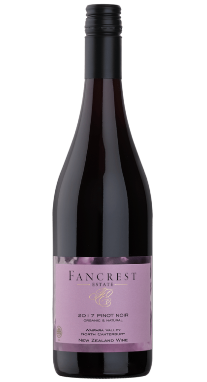
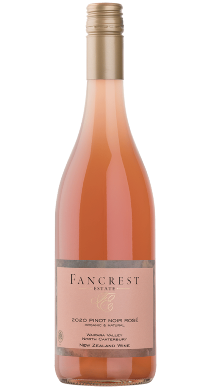
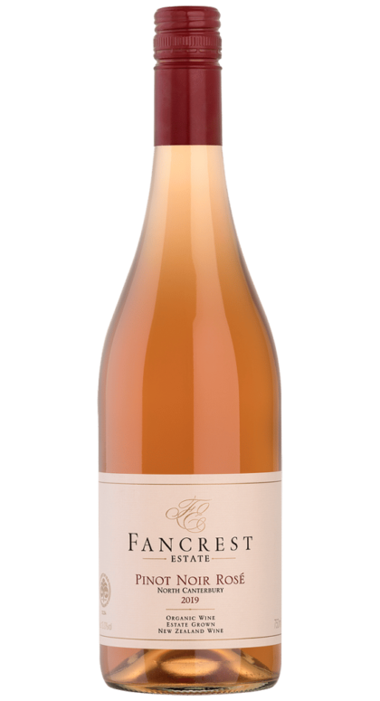
We wanted a simple, elegant and sophisticated label modeled on the classic Burgundian paradigm.

It had occured to us at the time that the proliferation of artsy “critter” labels suggested a general preoccupation with marketing, promotion, and publicity rather than with the quality of the wine.

We felt a well-crafted label should convey to the potential purchaser a sense of what he or she might expect on opening the bottle.

"Wine is a uniting moment... It brings us together around the table, of course, but it also catalyzes all of the best things around us in life - from the dirt in the vineyards to the runways of high fashion and design, wine inspires all of our emotions and senses. We have been privileged to work together with Jeffrey Caldewey, an Icon of the California wine world himself, for more than twenty years now, and always return to him. His sensibility and sensitivity to wine's transcendent properties fuels our appreciation and our continued collaboration. Icon's storied reputation speaks for itself... Spending time with the volumes documenting their work is to re-live the birth of the modern wine culture in America, and the extraordinary influence that Jeffrey Caldewey and his equally famous partner, Chuck House have had in leading a revolution for wine packaging that has spread from California to the world."

Without over-intellectualising an experience that is essentially sensory, here are some of Chuck’s thoughts:

  • The initials are from the classic period when the original European varietals were being developed, a link to the history of Pinot Noir, but not an attempt to make this an Old World pinot noir, but still an homage.
  • The interlocking F and E can be seen to symbolize the organic synergy of wine and the land from which it comes.
  • The curves of the F and E have a look of a classic billowing sail, evoking the wind and sea that symbolize New Zealand in the popular imagination.  Clean and fresh.
  • And most importantly, he intended to imbue a sensual quality in the way the two letters insinuate themselves together. That’s the quality that Pinot Noir always seems to have as it’s calling card.

The best stories are always about love and connection so that’s the story that is embedded in this imagery!

Please follow and like us:

Leave a Comment